I’m one of six technical Agile coaches engaged by a large bank to support an initiative to improve software delivery performance. The IT department is an established agile software development shop that uses the SAFe framework with Scrum at the team level. They are seeking to achieve continuous delivery, improve software quality, establish a developer-friendly working environment, and foster a culture of continual improvement.
We want to be able to show the effects of changes the teams make in their working practices. Improving delivery performance involves changing the way people work; therefore, we need measurements that aren't dependent on doing the work in any particular way. Three metrics from the Lean school of thought are helpful: Throughput, Cycle Time, and Process Cycle Efficiency (PCE).
The Agile Metrics: Cycle Time and Process Cycle Efficiency
It isn't the purpose of this post to explain these metrics -- we offer more about understanding Agile metrics here -- but here’s a quick summary. Cycle Time is the time it takes to complete one work item. Throughput is the number of “value units” delivered by the process in a given unit of time (say, per release or per month). Process Cycle Efficiency (PCE) is the proportion of total lead time in which value is added to the product. If we take a look at these measures at the start of an improvement initiative and again at the end, we can see whether the organization has improved its delivery performance.
To adapt these metrics to software development, we need to adopt somewhat softer definitions of “work item” and “value unit” than is usual in the manufacturing domain. For our purposes at this client, a “work item” is a User Story, the type of work package used with the Scrum framework. A “value unit” is a software feature. While these things can be somewhat loosely defined and can vary in size, these working definitions are sufficient for our needs.
It’s easy enough to get Throughput using the tools they are already using. We can get a crude sense of Cycle Time from their project management tool by subtracting the start date from the end date of each work item, but we want a little more granularity than that so we can show the effects of external dependencies, back flows, meetings, and context switching on Cycle Time. There is no practical way to get meaningful PCE out of a project management tool, so we need to collect the raw data for that as well.
To show the impact of changes in team structure, delivery process, and technical practices on delivery performance, we want to compare these measures at the beginning and end of the coaching engagement. We’d like to see Throughput and PCE increase, and we’d like to see mean Cycle Time and Cycle Time variation decrease.
Generally speaking, increased Throughput means the teams are delivering more software in each release than they were previously. Increased PCE means the teams are spending proportionally more of their time adding value than they were previously. Reduced Cycle Time means the teams are able to complete work items in less time than previously. Reduced variation in Cycle Time means the teams are learning to decompose work into similarly-sized User Stories, and/or they have eliminated some of the blockers that had been present in their process. Reducing variation in Cycle Time improves planning predictability, which usually leads to greater stakeholder confidence in the teams and higher trust across the organization. In turn, those factors feed back into delivery performance in a positive way.
You may have noticed that there is no mention of comparing estimates with actuals. This is an entirely empirical approach. Observed, actual performance is of interest. Optimistic stretch goals, coerced commitments, and guesses are less informative than empirical observations. These teams follow the usual Scrum ceremonies and practices, including relative sizing of User Stories in terms of Story Points and estimation of tasks in terms of hours. We do not find that information useful for understanding the effectiveness of software delivery.
Collecting the Raw Data
The typical way to collect baseline numbers for these metrics is to conduct a value stream mapping workshop that involves most or all team members for one day or longer. The client is worried about losing too much time in the workshops when the teams could be doing value-add work. Therefore, we needed a less intrusive way to collect baseline measurements. There is also the question of how accurate the PCE data will be when it is obtained through a workshop rather than by direct observation of team activity.
I came up with the idea of using Lego bricks to collect the raw data for Cycle Time and PCE. There is some impact on team member time, but hopefully it is not too intrusive. My observation is that people enjoy manipulating Lego bricks, and they don’t mind sticking the bricks on a plate to represent their work.
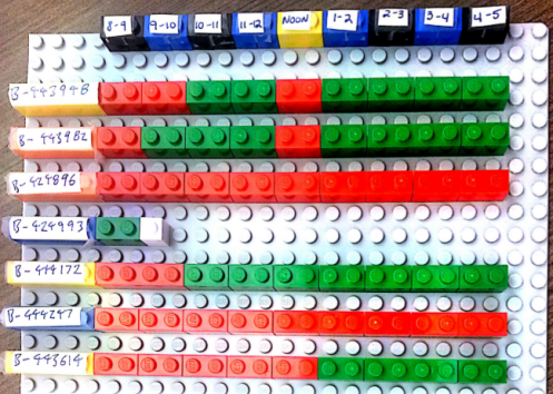
For each team, we set up a Lego plate large enough to hold about 10 or 12 1×2 bricks. We allocate one row of bricks for each User Story. For each hour in the day, team members place a green brick when they performed value-add work on the User Story, and a red brick when the User Story was in a wait state during that hour. A 1×1 white brick is used to show User Story completion. We don’t worry about counting minutes. At the end of each day, we collect the data from the Lego plates in a spreadsheet and remove all the bricks for a fresh start the next day.
Here’s how the Legos looked at the end of the first day for the first team that set this up:

Each team tweaks the setup in their own way. In this case, the row of black, blue, and yellow bricks across the top of the plate represents the hours of the day. Black and blue colors alternate for visual clarity. The yellow brick represents the lunch hour. User Stories are identified by their key in the team’s project management tool.
From the state of the Lego bricks, you can see that the team had six User Stories in “in progress” state. For the first one, value was added during one hour out of eight. There are no 1×1 white bricks, which means none of these User Stories has been completed.
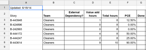
At the end of each day, I collect the data from the Lego plates and accumulate the values in a spreadsheet. Here is how the spreadsheet looked when I had entered the data from the board above:
After capturing the data in the spreadsheet, the Lego plate is cleared and we start the next day with a clean slate. There is no need to extend the Lego bricks indefinitely, as we are interested in accumulating Cycle Time observations and not in building up a physical history of User Stories in the form of Lego bricks.
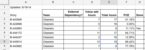
Here is how the board and spreadsheet for the same team looked after the second day of collecting data:
What we do with the information
The plan is to collect this information for a couple of sprints at the start of the improvement program, and repeat the collection again for a couple of sprints toward the end of the program. We don’t want to create an ongoing administrative task for team members. We are interested in:
- Mean Cycle Time – average time to complete a User Story
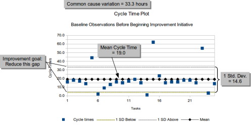
- Common cause variation – variation within one standard deviation indicates common cause variation; that is, variation that is caused by systemic factors (organizational or team structure, process steps, technical practices, etc.). This can point to potential structural or procedural improvements.
- Special cause variation – variation beyond one standard deviation indicates special cause variation; that is, variation that results from unusual events or one-time problems. This can help us define policies to deal with unexpected issues in a way that doesn't significantly impede continuous flow.
- Clustering – Cycle Time observations may settle out into multiple clumps. This indicates User Stories that have certain characteristics have a different effects on Cycle Time. For example, User Stories that have dependencies on external teams or outside vendors may tend to have longer Cycle Times than User Stories the team can fully control. Understanding the impact helps us perform short-term planning effectively.
- Process Cycle Efficiency – low PCE may point to “time sinks” in the process that we can address. External dependencies are an obvious cause of wait states, during which no value can be added to the User Story in progress. Wait states may also be caused by team structure, when teams of specialists are organized in silos, and multiple teams must be engaged to complete a single User Story. Context switching due to high WIP is another obvious cause. It’s useful to be able to make these effects visible, as people are more willing to address underlying issues when they see evidence than when they just hear words.
We are more interested in aggregate numbers than in individual User Stories. Mean Cycle Time (possibly broken out by categories of stories) helps with short-term forecasting. Beyond that, we can look for opportunities to shorten mean Cycle Time and to reduce variation in Cycle Time to improve continuous flow.
Here is a generic example of a chart we might generate from observations of Cycle Time. It is not based on the specific teams mentioned here — we haven’t been collecting data long enough to develop this sort of visualization.
Initial observations
Two of the four teams involved in this have embraced the idea openly, and the other two are hesitant because they have not yet seen how it might help them. The two teams that have embraced the idea started to change their habitual behaviors almost immediately, as soon as the wait states in User Stories became visible.
1. Immediate reaction to impediments
It’s a commonplace that when something is made visible, people act on it. I was surprised to see the natural response when a team member reaches for a red brick. Others on the team immediately ask what the impediment is and how they can help. These were already practicing “agile” teams, so they are already stable teams working in team spaces, and collaboration was not a new concept at the start of the engagement. However, the immediacy of their reaction to seeing a red brick is a radical improvement in the speed with which teams respond to emerging issues.
You might point out that basic “agile” practice includes posting an indicator on the User Story card on the team’s wall as soon as an impediment comes up. These teams are not in the habit of doing that, so there is typically a delay before the team begins to act on impediments. A couple of these teams did not have a card wall at all when we started working with them. They believed their electronic project management tool served the same purpose as an information radiator, which of course it does not. The organization has been using “agile” methods for several years, but not every team does every little thing to perfection.
2. Limiting WIP
A second natural reaction to the boards is that when a team notices a large swath of red on their board, they start exploring the reasons why. Without any formal training in Lean concepts, they quickly conclude that they have too many User Stories in play. They limit their WIP, even without knowing that term. Before the impact of high WIP was visible, team members often said they did not understand the “big deal” about pulling just one or two User Stories at a time.
Management looks at the burn charts and cumulative flow diagrams (CFDs) for each team. Nearly all teams in the organization have the classic “hockey stick” burndown chart, and a CFD that looks like a single block of color representing “in progress.” The teams that have started to notice the impact of high WIP thanks to their Lego boards are already starting to show burndowns that look like actual burndowns. They are pulling User Stories through to completion rather than starting everything on the first day of the sprint. Within days, it became a sort of game to see if the team could eliminate all the red bricks from their board.
3. Tracking unplanned work
A third reaction has to do with “user stories” that are not really User Stories. Many of the teams in this organization define “user stories” as placeholders for unplanned work. Scrum is generally good for managing planned work — the Product Backlog lists features to be developed in priority order by business value. Each Backlog Item is decomposed into one or more User Stories, which can then be pulled into Sprints for development.
Teams that service requests from other teams do not know in advance when the other teams will request services. The requests are not in the Product Backlog. As an expedient to fit this into the Scrum framework, they define pseudo-stories where they throw in “tasks” when other teams submit requests for services. They try to account for the impact by setting aside a portion of their available time each sprint to handle whatever unplanned work may come in during the sprint. This tends to throw off their sprint forecast, but they can’t think of another way to account for the work that is consistent with their understanding of the Scrum “rules.”
A consequence of the practice is that these “user stories” appear to have Cycle Times equal to the Sprint length and to spend almost all the time in a wait state. This is because they are ongoing, open-ended “user stories” that can never be completed, and most of the time there are no unplanned requests in progress. If they continue to do this, their Cycle Time metrics will be skewed. Making Cycle Time visible causes these teams to reconsider the way they define and track unplanned work.
Without prompting, some people have suggested moving to a Kanban system that supports explicit policies for different classes of service, rather than trying to define every type of work as a User Story. Others are considering allowing urgent “stories” to be added mid-sprint and having the Product Owner remove scope from the sprint backlog, as per standard Scrum practice. The important thing is that they are thinking about better ways to manage unplanned work.
4. Manager response
The managers over the Release Train were very interested in how Cycle Time and Process Cycle Efficiency were being used. I explained what the metrics mean and how we intend to use them to show progress with the process improvement goals. I took them on a tour of the four team areas and they saw how the Lego boards had been set up. They asked team members whether this was helping them, and got mixed, honest answers. The managers noticed that some teams routinely work through the lunch hour and some routinely work 10 hour days. They expressed to the teams that they don’t want them to burn out and they want to figure out ways to get the work done in a sustainable way during normal working hours. This had a positive effect on team morale.
The managers were just as interested in playing with the Lego bricks as the team members. They suggested various changes, using additional colors to represent details about wait states. I suggested that we keep it simple. We don’t want to turn this into yet another administrative overhead task for the teams. I think I convinced them that we only want to capture the wait times, and leave root cause analysis for later.
5. Micromanaging time?
A couple of people voiced the concern that we were asking individuals to keep track of how they spend their time. The organizational culture is such that management expects people to get their work done, and does not track when, how, or where they work. I had to clarify that this is about tracking time from the point of view of a User Story, and not from the point of view of any individual person. We want to expose time sinks so that we can help management change the organizational structure and formal procedures in ways that make life better for development teams. Once that was clear, people were not opposed to it.
